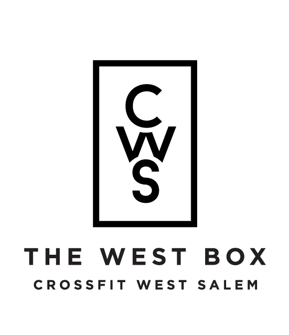
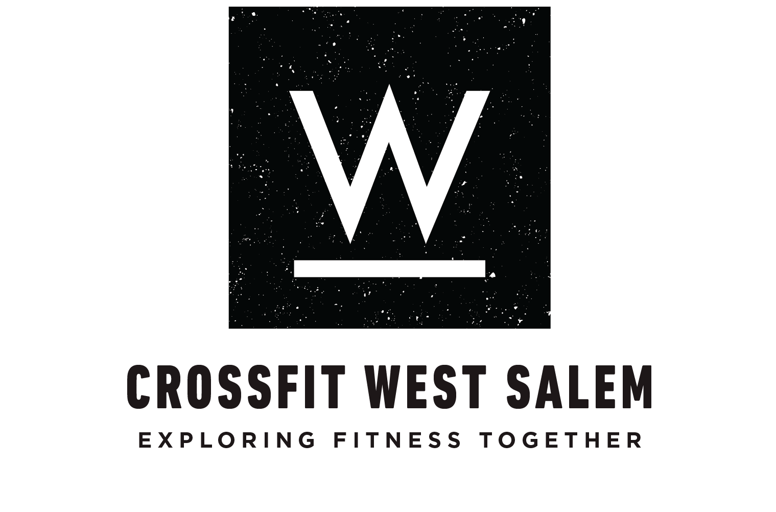
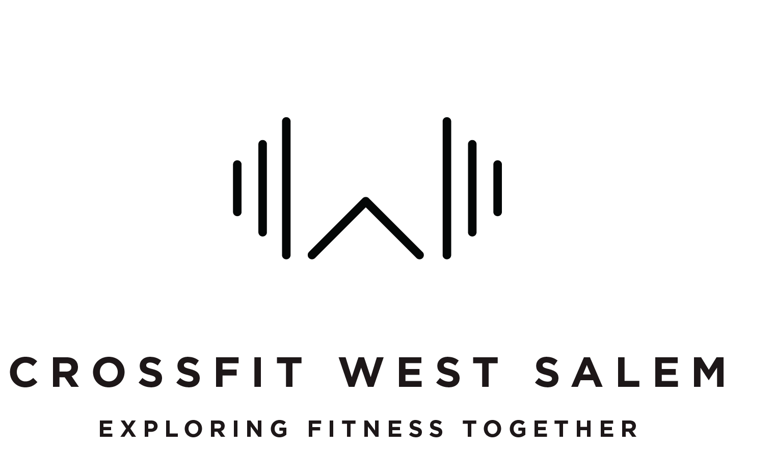
West Salem Crossfit
Logomark
The intention was to create an brand identity that would allow West Salem Crossfit (or better known as The West Box) stand unique and autonomously from the affiliate Salem Crossfit. The owners had a clear vision of having a logo that wasn't typical for the fitness industry and steered clear of typically associated iconography (weights, dumbells, armor etc) but was still strong, angular, geometric, sharp and had some recognition of being part of the Pacific Northwest.