
Microsoft Security Product Icon Suite
Creating a strong, simplified, scalable icon taxonomy and framework, composed of a set of beautiful, modern marks.
I led development of a scalable icon system for Microsoft Security's growing product portfolio. That meant auditing the existing icon set, building a taxonomy designed to scale, and personally designing icons for Sentinel (Security), Purview (Governance), Priva (Privacy), and Intune (Management). I also contributed to Defender (Security), Entra (Identity), and Security Copilot (standalone) through design rounds, refinements, production work, and asset management. Each icon stands on the same shared framework, with room to feel distinct inside it.

Title: Senior Product Designer
Project-specific role: Lead Icon Designer
Team: Security Expressions Team, Security UX, for horizontal effort across enterprise Security product suite
Key Deliverables: Icon design, Icon taxonomy, Icon family, Production system, Asset Library
When Every Icon Is a Bespoke Problem
Icons across Microsoft Security were designed one at a time, by different teams, with no shared rules. Some leaned literal, some abstract. Color, weight, and metaphor shifted product to product.

Icons meant to work as navigational anchors created friction instead: mismatched metaphors, uneven quality, unclear relationships between products.
There was no set taxonomy. No production standard. No shared way to evaluate a new icon before it shipped.
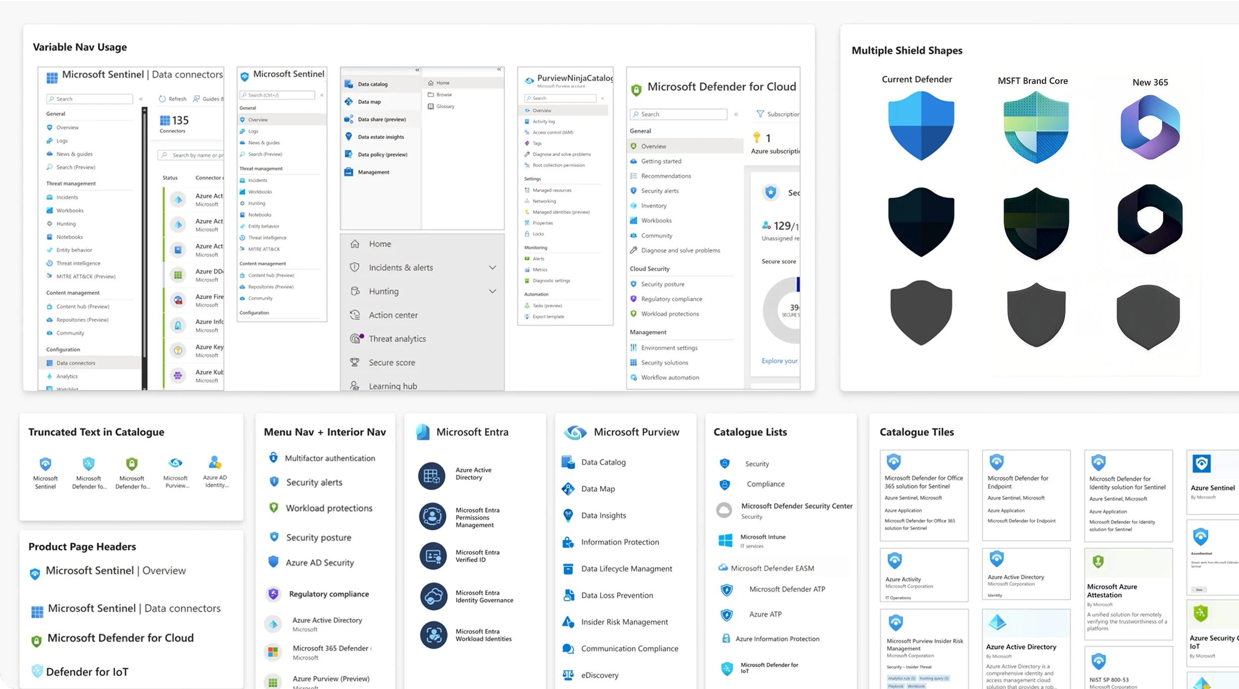
Visual inconsistency was just the symptom. The missing piece was a shared framework for making those decisions in the first place.
Building the framework before the family
Auditing the Chaos
Defender was the accidental blueprint. Its blue palette had quietly become the default starting point for everything that followed. But every other icon had been built separately: different teams, different times, no shared vision for how they'd sit together. They read as strangers who happened to share a last name. That insight became the foundation for everything that followed.

Security Suite Product Icons in marketing

Security Suite Product Icons in product
Defining the Rules
Fixing individual icons wouldn't fix the underlying problem. The portfolio needed a decision-making framework: a taxonomy for how metaphors map to product concepts, a quality bar for craft and clarity, and production standards a team could actually apply.
As Senior Product Designer with cross-product scope, I owned this framework end to end. I acted as the connective layer between product, marketing, Fluent, and executive stakeholders, keeping it coherent as it scaled.
Every icon runs through the same three-phases:
Audit: how is the product already described, in language and imagery, apart from its primary icon
Theme development: push past the literal (a device, a lock, a shield) toward what the product actually does, then test which broader themes resonate.
Distinctiveness check: where have similar metaphors already been used across Microsoft and beyond, so the result stays recognizably Fluent without disappearing into it

Intune is a clear example of how an icon conceptually evolves within the design process. Concepts moved from more literal device metaphors, through a data-and-interconnectivity, to the abstract ribbon language Microsoft 365 and Copilot now share.


What began as a fragmented set of visuals became a cohesive system. These icons can stand alone but also elevate each other as a family.

Designing Inside the System
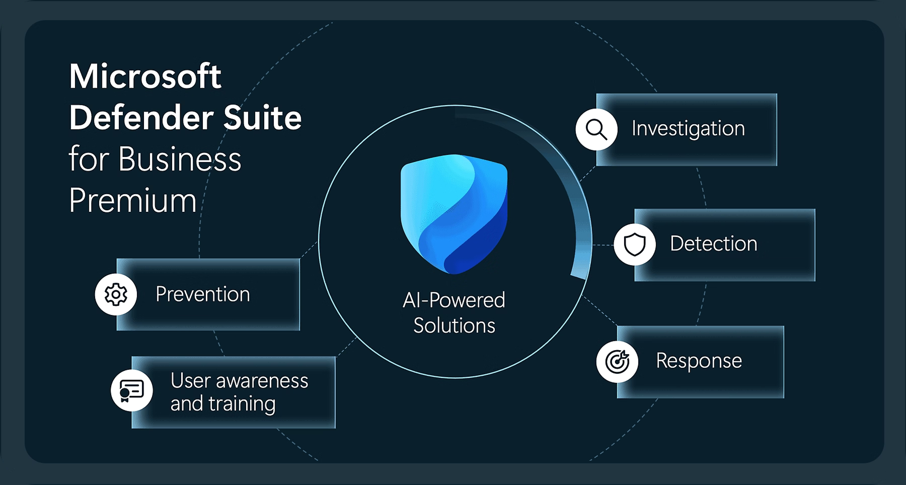
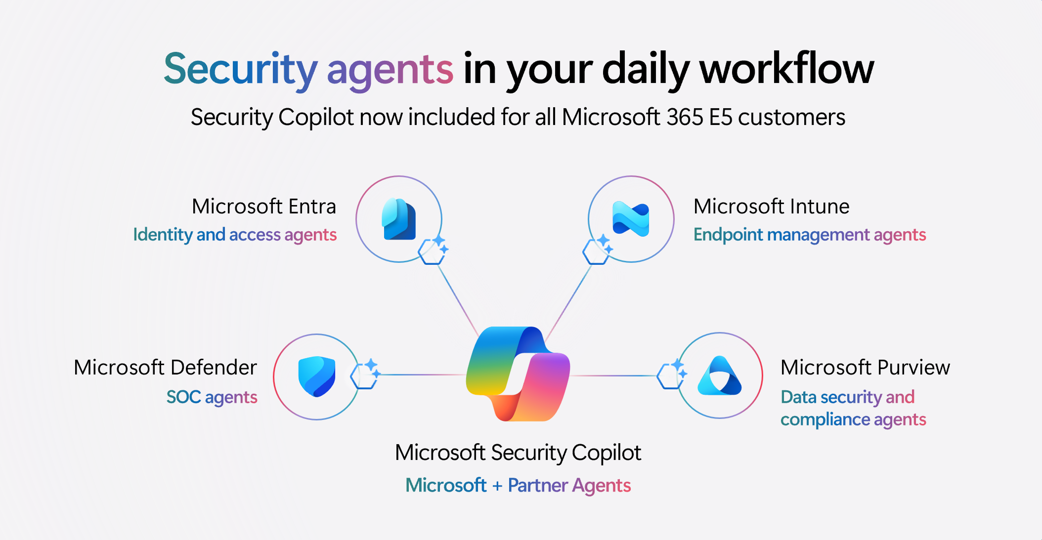
I led or contributed to icons for Defender, Sentinel, Purview, Priva, Entra, and Intune, each built to carry its own meaning without fragmenting the larger family.
Every icon was built to spec with Fluent's geometric grid, full-color, monoline, and fill variants, and cleared through formal trademark review before shipping to product teams and marketing and brand partners.

Fixing the Process
An early round of executive review surfaced a real problem: work was reaching leadership before it had been properly aligned upstream. I used that misstep to redesign the review sequencing itself, building in earlier stakeholder alignment and clearer documentation of intent.
Late-stage rework dropped. Trust in the process, and in the value of good design, went up with it.



Impact
Unified Icon Family
A consistent, scalable icon set spans the full Security portfolio.
Taxonomy and Quality Bar
Clear rules for metaphor, craft, and production replaced one-off decisions.
Built to Scale
New products and features extend the system without requiring new rules.

“You didn't just make assets, you built systems with clear guidance, naming, and governance so others can repeatedly get things right... You've shifted our UX org from assets exist to great assets and systems exist and are easy to use." - Katie Orenstein, Principal Design Manager

Recognized in Microsoft Design's Official Icon Refresh
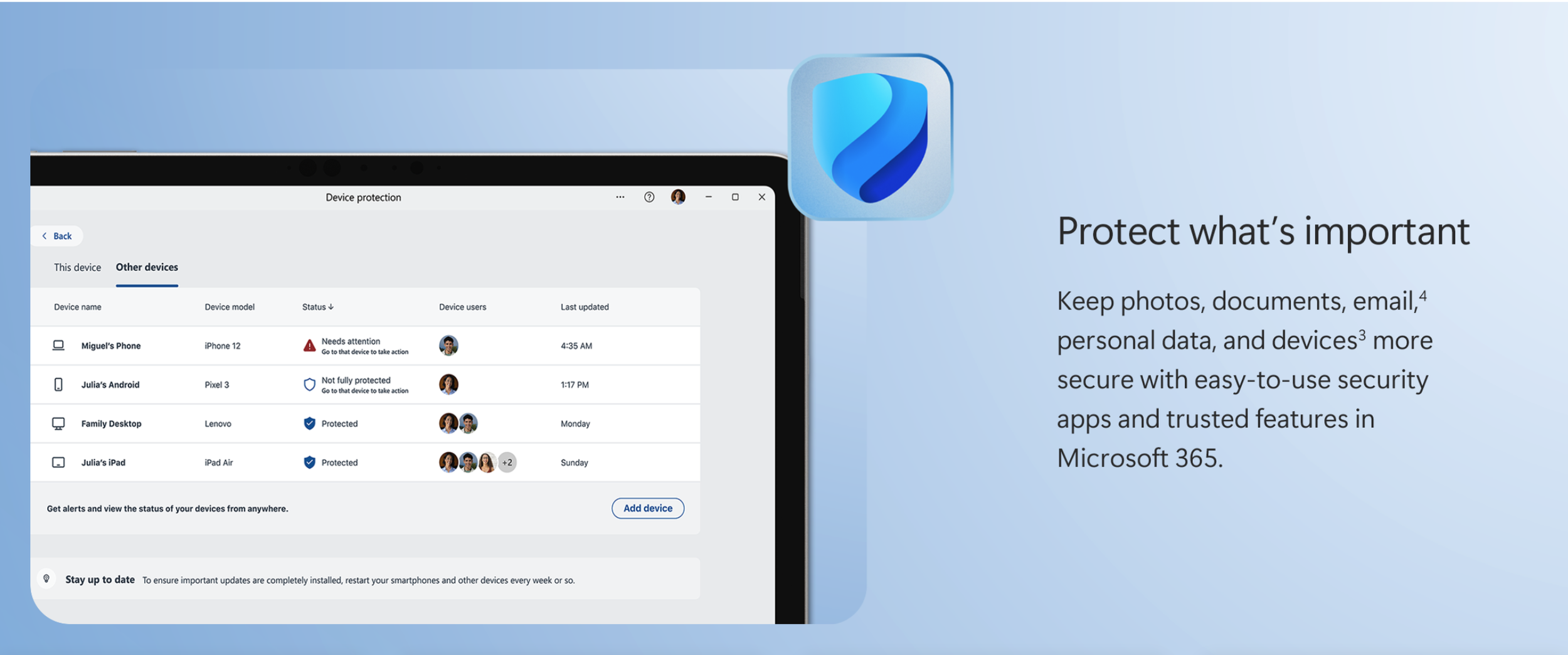
My work on Defender, in collaboration with the Fluent Expression Team, fed into the broader Microsoft 365 icon refresh, later recognized in Microsoft Design's official recap, "Fluid Forms, Vibrant Colors." I'm credited by name among the project's core contributors.




The System Outlived the Icons
The icons were the tangible output. The real outcome was shared understanding, clear enough that the system could scale across teams without needing me as the single point of review.